Yorkshire Bitter : Creating a Landscape Screen Print for Asda and Black Sheep Brewery
It was May 2024 when I was first asked by Asda to create artwork for their first collaborative beer range, where they’d be working with craft breweries from across the country. The concept was to match artists to breweries by location and complimentary style, whilst creating an eclectic mix of artwork. It sounded like a brilliant project to be involved with and also great to be working with the West Yorkshire supermarket, who are based just down the road in Leeds.
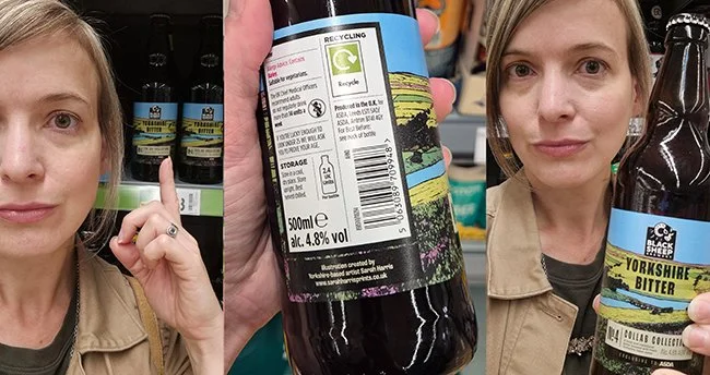
The artwork brief was given to me late July and I was really pleased to find out I’d be working with Black Sheep Brewery, who are based in Masham in North Yorkshire, on their Yorkshire Bitter. We discussed concepts; Black Sheep and Asda both wanted to highlight that the beer was made with Yorkshire water, plus ideally it would be a distinctly Yorkshire view for this Yorkshire beer. At this point I also found out I would be designing a bottle label and was sent a mock-up with text and I realised I would have to be careful of the landscape I used as it would have to fit in well into the allocated space.

After a bit of research, we discussed a few options of imagery and came to a consensus, then I booked a night at the Black Swan in Fearby for the following night, deadlines were tight and I draw pretty slowly so it was important I started immediately. There’s not much in Fearby, but it’s the beauty of the Nidderdale location that’s the real draw, and it’s about as near as I could get to the viewpoints I wanted to visit.

Location wise we’d decided to focus on Leighton and Roundhill Reservoirs, which are located just into the Yorkshire Dales and are the nearest reservoirs to Masham, supplying both Harrogate and Leeds with water. When I arrived I scouted out the two locations, having a wander around Leighton and working out the best place to park near Roundhill. Luckily my friend and fellow maker Charlotte Morrison grew up in this area, which is very rural, so she had lots of helpful tips for me.
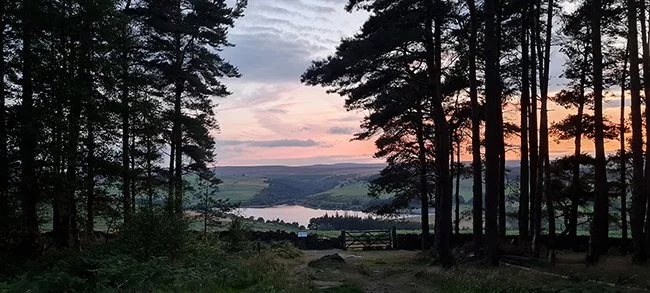
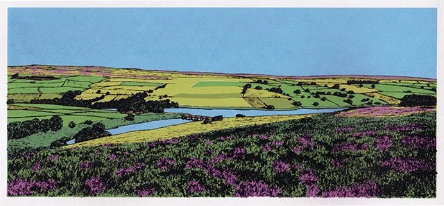
In the evening I visited the pine forest around Swinton Bivouac. I first wandered to the Druid’s Temple, a dramatic and expansive folly based on Stonehenge built in 1820 by the owner of Swinton Park Estate. Just a little further through the woods and you reach a clearing with a great viewpoint from the edge of the tree line down to the Leighton Reservoir where the sun sets just behind the water. I stayed there for the whole show, to take in the stunning view and the beautiful sunset and had the place pretty much to myself which was both eerie and pleasing…oh and I took a shed load of photos!
This time last year we were also in a heatwave, temperatures were hitting 24 degrees by 8am and the clear skies also meant the landscape became washed out or hazy with the intense sun. As much as I struggle with getting up early (ever since I got fatigue with Hypermobility Spectrum Disorder) it was the only option to see the views at their best. It turned out sunrise was at 5am and however much I wanted to see golden hour, I couldn’t bring myself to get up at that time. I decided 6am would be a reasonable compromise, and should mean the light would still be fairly good, with the bonus of avoiding the intense sunshine.
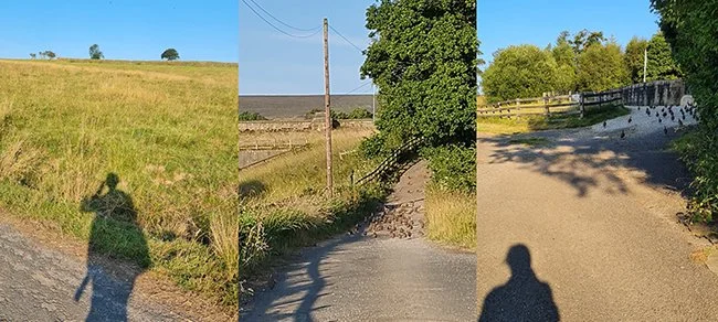
At 6am my alarm went off and I begrudgingly got up, pulled on my clothes, grabbed the few supplies I brought (a banana, half a pack of Jaffa Cakes and some water) and I was off. On the short drive I saw plenty of pheasants and grouse but not a single car. I parked up in a layby and strapped on my boots. I passed a few cormorants enjoying the quiet as I went over the road that crosses over Leighton, then on to a farm road where I followed a large flock of grouse walking up the track towards Roundhill dam. As I reached the reservoir I was greeted by the beautiful sight of the still water reflecting the sky, I stopped to look and take some photos but time was against me as the light of Golden Hour was fading and I still had a way to go.

Following the route of the Six Dales Trail up the hill and on the moors I hadn’t seen a single soul, I didn’t even see a sheep until I disturbed one as I walked over to take a photo, it jumped up and scared living the daylights out of me! I headed upwards towards the Colsterdale sighting tower perched above Ilton Moor and Arnagill Crags. The stone tower is one of three built to help guide in the construction of the reservoirs and pipelines designed to store the waters of Pott Beck and the construction is grade II listed and distinctive in its design. As much as I wanted to go in for a closer look, there’s no direct path and it was ground nesting season so I just continued with my ascent rather than upset any birds. Or gamekeepers.

I did my “stop/start” walk, as my husband likes to call it, where I stop to take photos at every angle every few steps so not to miss an even better view. An abundance of photos gives me options for when I get back to the studio, especially as I had a very precise layout to fit my image into and no time to revisit the location. As I began to reach the top of the footpath where the reservoir goes almost out of view, gamekeeper’s car slowly passed me on the gravelly road. He was the only human I saw on the entire walk.

As the temperature was rising I headed back down the hill having decided against a loop. I scrolled through the photos as I wanted to check I had enough images to work with. I revisited a few of my favourite options as I retraced my steps and took in the stunning views over Nidderdale valley. It’s a beautiful area and one I would definitely come back to, the heather was just starting to appear and I think these views would be extra special with a sea of purple.
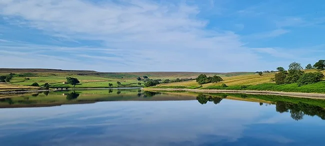
I got a better view of the tower on the way back, a few more sheep were now roaming about. I upped the pace when I realised I could make it back for breakfast at the hotel, but I had to be quick! The reflections at the dam were even more vivid so I had to stop again for more photos, before returning to my mission to get back to the car. By 9am I’d eaten a veggie cooked breakfast just before the cut off, well needed after walking over 10,000 steps on only a banana. I went back to the room and for a little lie down and to freshen up before checkout.
On the way home I popped into Masham to visit the lovely Masham Gallery to see Angela Hall’s screen print exhibition and caught up with owner and artist Josie Beszant. I also bumped into fellow Leeds printmaker Janis Goodman dropping of some of her work, she creates the most stunning etchings.
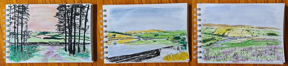
Back at the studio I trawled through the many photos I’d taken and decided to sketch out three of my favourite design options before colouring with a watercolour wash. I scanned and mocked these up onto the labels to show the Asda team, who went with my preferred choice.
Before my printmaker life I worked in retail head offices in marketing, buying and design so I know that to get approval, especially with a project as unusual as this, designs can be seen by numerous people and potentially there will be a lot of opinions (I have no idea if this was the case here). As I wanted to use my process of drawing and then screen printing, any major changes would be difficult to accommodate with a fast approaching deadline, so I kept the team at Asda as involved as possible, before it got to the point of no return.
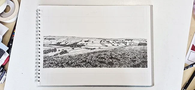
With the subject and layout approved, I drew out the design, created the colour separations and got these sent off to my printers for acetates to be made so I could expose my screens before test printing. All this was in record time for me, I believe less than a week which is unheard of for my work.

Colour-wise I would generally think to go for darker tones for a bitter, but as the product was in a dark bottle I thought it would be good for the artwork to stand out against that, so I actually went brighter than my normal work.
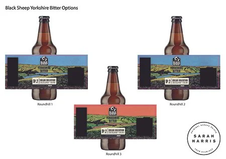
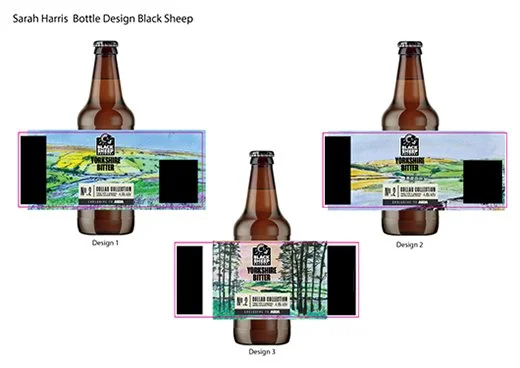
Again I decided to submit three options; two colourways plus one option with and without heather, as I couldn’t decide if bitter drinkers would like the heather as much as I do, but that was the one that was selected. Again it was my favourite so I was really pleased with that decision.
Here is the final screen print, I made a complete image even though a lot gets covered with the information and will never get seen, and I reduced the line-work around the branding to keep this as clean as possible. I also made the final artwork bigger than needed, I felt the placement of the reservoir and horizon were extremely important, so it was better to do too much landscape than too little to get the alignment spot on.
Fast forward to May 2025 when my beer is out in stores, along with the first of the beers in this project, with more to follow later this year.
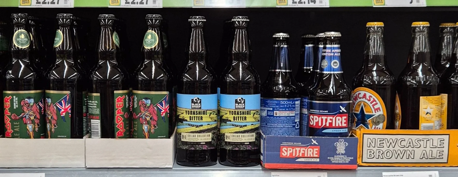
I loved seeing the design out in real life and how it turned out, especially how the artwork sat on the shelves alongside the other beers. I think it really stands out from the rest thanks to that bold blue. What do you think, did I answer the brief? I do hope you like the beer and the design!
You can also buy the beer online, here.